How to Create Mobile Optimized Amazon Product Listings
We just got done preparing over 100 Amazon product listings for a client. Part of the process is to look at the top competitors’ listings and apply a scoring system to see how we stack up against them in keyword rank, readability, and conversion strength.
Much to my surprise, most of the competitors scored really low in one key area……..mobile optimized product listing images. They probably don’t realize that in a “mobile-first” world, this is one of the most important elements on an Amazon product page.
Amazon Product Listing Images for Natural Products Brands
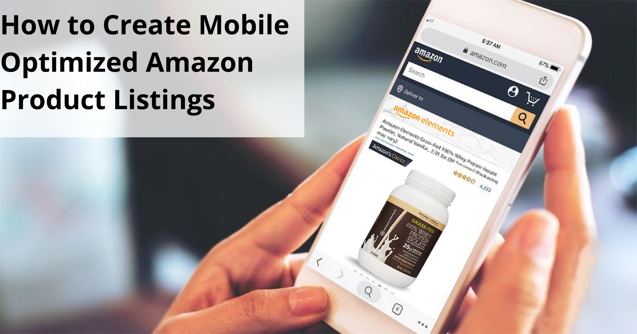
Amazon product listing graphics are the first thing you see when you shop Amazon on mobile – not the bullets. And guess what………nearly half of all Ecomm shoppers are shopping on mobile now. The trends show that mobile shopping will continue to grow at a significant rate according to a U.S. Mobile Retail Sale Report Published by Statistica.
But here’s the problem. Professional marketers generally don’t do their jobs working from their phone. At least not the heavy lifting stuff. And so even though the whole Amazon marketing world is preaching “mobile first”, that’s not the lens the marketing professional is looking through. Most Amazon marketers are doing what they did 3-5yrs ago, which is focusing very heavily on the keyword analysis and optimizing the title and first few bullets of the copy listing. While this is no-doubt important, you’re leaving a lot of opportunity on the table if you don’t then take that bulleted listing and translate it into a graphical story. Take a look at the listing below as an example. This is a brand new product listing on Amazon at the time this article was published. By the way, this listing is growing at 100% per week since launch and has a 70% conversion rate – blam!!!
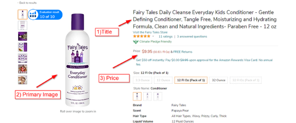
First, let’s view the listing on desktop and carefully examine the priority of communication (that is: the order and emphasis of each element in the listing as it’s seen through the audience’s eyes).

Amazon Product Listing Priority of Communication – Desktop
- Title
- Primary Product Image
- Price
- Description Bullets
- Secondary Product Pictures in the Carousel
One important thing to note here is that, on desktop, you can see all of the elements in the priority of communication at the same time (no scrolling). You can be sure that Amazon spent a lot of time testing various different formats over the years to finally arrive at this one. They want to make sure that all of the most important information that you use to make a buying decision is as close to the top of the page listing as possible with very little scrolling.
Everybody may look at this a little differently but, for the most part, the primary graphic and the title get most of your initial attention. From there, you see the price and then the bullets, and finally the secondary pictures in the carousel. If the shopper is looking at carousel pictures, it means they are generally comparing the detailed advantages of one product over another in order to make a purchase decision.
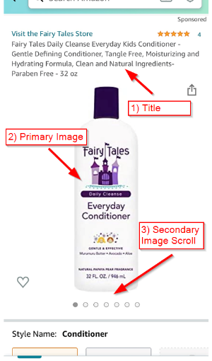
Now here is the same listing on mobile:

Amazon Product Listing Priority of Communication – Mobile
- Title
- Primary Product Image
- Secondary Product Pictures in the Carousel
- Price
- Description Bullets
The obvious and possibly most important difference when comparing the desktop with the mobile listing is that, on desktop, you can see the whole priority of communication at once. But with mobile, you can’t see anything beyond the graphics until you scroll. And you would be amazed at how many people don’t really feel like scrolling. Instead, they roll their thumb horizontally through the pictures because pictures are so much easier to digest on mobile compared to reading copy. As simple as that is, we’ve seen HUGE differences in performance in listings that communicate effectively via the Amazon listing image carousel.
The Best Way to Optimize Amazon Product Listing Images
They say a picture is worth a thousand words but telling a graphical story with pictures is not an easy thing. A truly great image can convey the message you’re trying to tell without saying a word. Unfortunately, a lot of brands just don’t have the resources to create custom graphics. In fact, most just use whatever images are available…..or they only include product pictures. This is where having a professional marketing consultant which a proven track record of success on Amazon can save you years of lost sales. Here are a few of the key things you want to focus on so that you can optimize your product page graphics on Amazon
- Make sure that each bullet in your listing has a corresponding image. Your bullets should answer the top five questions the shopper will have about your product and the images should do the same. At the time this article was published, Amazon would allow up to eight product images in a listing plus one video – make sure you use them all!
- Copy overlay. This is placing text over the top of the image. This is an absolute must, but make sure that you don’t have too much copy. Some companies try to create infographics and it ends up being too noisy and unreadable. Just one or two key phrases per image is ideal.
- Make sure lifestyle images relate to the features and benefits of your product. Too many brands tend to choose pictures that that are visually appealing, but don’t necessarily have anything to do with the product.
- Show the product in action, delivering results. There’s an old saying, “people don’t want to buy a power drill, they want to buy the hole it makes”. Make sure your images show results!
- Extra value related to size, or texture, or shape. For example, larger serving sizes relative to the competition. Or some physical feature that lends to the value. For example, vitamin shoppers prefer smaller pill sizes, so most of the top vitamin listings show the size of the pill.
- Demonstrate different uses for your product. For instance, while most nutritional or protein powders are intended to be blended in a shake, many of them can also be added to foods or made into different recipes. Don’t assume your audience knows this. Make sure to show any and all uses for the product.
In the coming weeks, we’ll be publishing a simple guide to help you optimize your Amazon listing graphics. Just go to the Contact Page, enter your information and type “Amazon template” in the message.
Organify Digital is committed to helping companies in the Natural Products, health, and wellness industries. If you need some quick advice, drop us a line and we’re happy to answer your questions.
If this article was helpful, please follow us on Facebook, Instagram or Linkedin.
